Formative feedback
Overall Comments
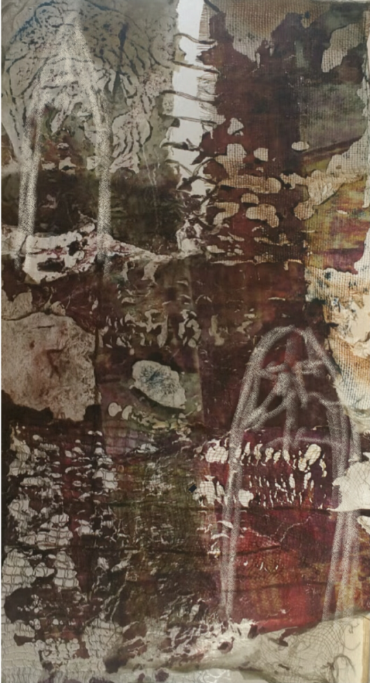
The fashion trend book is the strongest output, having benefited from the development work from ex.6.1. There is less work than expected in response to some of the other exercises, however, particularly for the debris project, where one existing idea has been visualised without evaluating its strength or considering alternatives. The written proposal is a suitable communication tool for this project but the visual aspects lack development, and the presentation of the imagery in the same format as the Brightly Light trend lacks analysis of the context and consideration of how the aesthetic of the theme could inform the presentation.
Feedback on assignment Demonstration of technical and Visual Skills, Quality of Outcome, Demonstration of Creativity
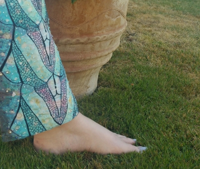
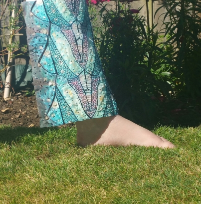
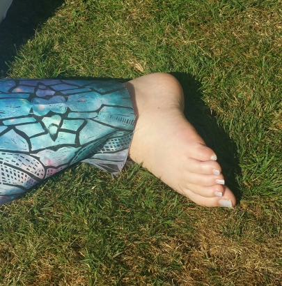
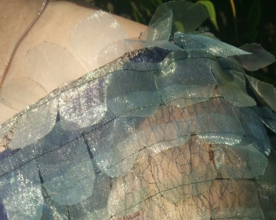
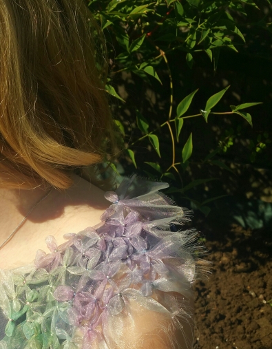
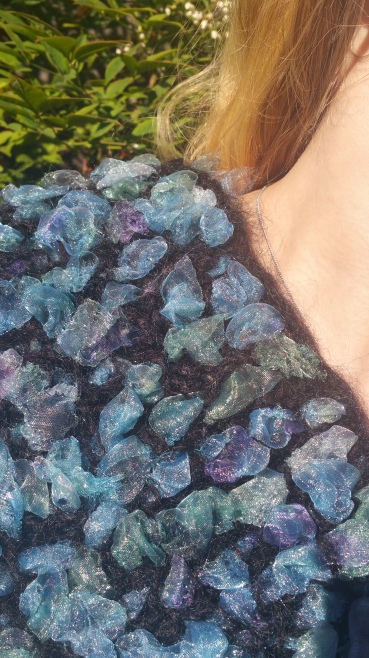
6.1 Indicative photography: You’ve explored different angles and compositions to visualise your fabrics on the body. Whilst the garden relates to the butterfly, you don’t mention how it communicates the Brightly Light theme. You identified that “a black top or dress beneath rather than the blue would focus the eye more onto the fabric”, and the same could be said for the background. For example, how would a flat background colour change the aesthetic of the image? The garden images vs more minimal background could have looked starkly different. Where would you expect to see such imagery (e.g. Vogue, Sunday supplement, fashion catalogue etc)? Whilst the garden background was justifiable, a stronger research method would have been to test more widely and then evaluate which approach worked best. I decided to use the garden not only due to its relevance to the butterfly but also for the light and for the flowers in the background. We were asked to consider backgrounds in the course notes. At the time I felt that a plain background, white for example would remove some of the feeling of fun found throughout the aesthetic and that it would feel too stark. As it happened, as the project progressed I did move towards a plain background for the final drawing as I felt that the backgrounds distracted the eye from focusing on the fabrics.
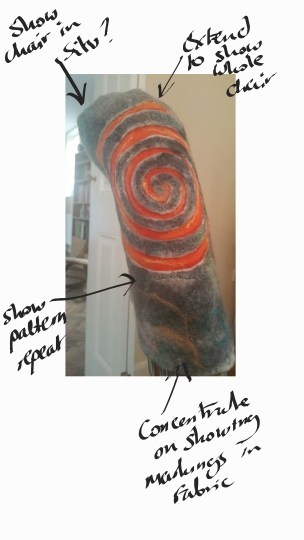
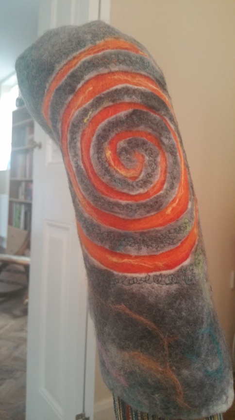
The interior context posed more problems for you to solve, as you fought with felt to make it curve around the cushion. The rug worked well, as the solidity of the felt made it a believable product. Your exploration is more varied than the fashion photos, with more varied products tested. The ‘pile of cushions’ image, though a simple idea, communicates your fabrics as a collection well, contrasting the changing scale of motif and density of pattern. I agree, I liked the stack of cushions and will be presenting this picture as part of my assessment submission. I didn’t choose it as a final image as the brief was to choose one fabric to develop and the picture showed the whole collection.
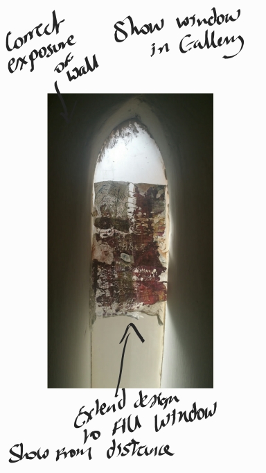
The art textiles in the windows resulted in some nice imagery – the fabrics were enlivened by the light coming through them. I agree, this is why I particularly liked the outcome of that project. Creating transparency is something I enjoy using in my work. I love the interplay of layers to create combined views, as can be seen in my debris work too.The evaluative questions at the beginning of 6.2 have given you a good structure in which to critique your work, though some of the answers could have resulted in more analysis of the work itself. “How successfully do the images communicate the context and whether the sample could be developed into the product type explored? The plain painted walls give an exhibition feel to the work and communicate the context of art textiles well.” The white walls confer the feel of a gallery but how does your work respond to this stark environment? You’ve evaluated the images but consider also what it teaches you about the work. I have added a short paragraph about this point.
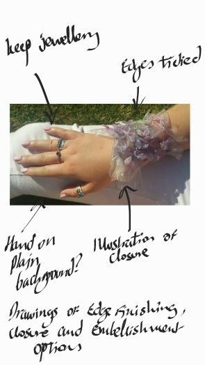
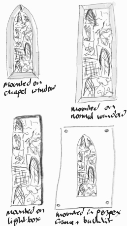
6.2 Propose in context The exploration for this part could have been much more varied, particularly in the interior context where there was potential to play with scale of motif on the chair. In the art textiles section, the quick drawings of ways to mount the work showed you using drawing to think about the communication of the work in more depth, which was great to see – more of this kind of thinking-through-drawing would be great to see in the sketchbook. You’ve made a good attempt to capture the transient colour of the organza fabric in the Brightly Light theme. The cuffs you’ve researched are made from hard materials, which have a very different commercial context- more research into relevant contemporary textiles products would have been beneficial. More analysis of this product context in contemporary fashion design could also have led to a more ambitious garment type being chosen. I must have misunderstood the instructions for this part a little. I thought we were to propose the use of our fabrics (that we had already produced) in context. This is why I didn’t alter the scale of motifs for example as the collection had already been produced. I couldn’t find any images of similar fabric cuffs (or bracelets) when doing my research. The sample lends itself to many different garments as investigated in the indicative photography where I showed it being used in a number of ways such as a shawl (or wrap) which, when I was originally working on the project was the end use I had in mind (as shown in my drawings at the end of assignment 2. Once I took the photograph of the sample around the wrist it looked a much more exciting proposition than a wrap or shawl so I chose to develop it in that direction.
6.3 – Trend book continuation This summarised your Brightly Light project well. The photos of layered fabrics presented the fabrics as a collection beautifully. The presentation is clean and minimal, and it’s great to full pages for some of your imagery. Some of the images were quite similar, so you could perhaps remove a few to make it more succinct (or crop some to make them look more different). I will take another look – thank you
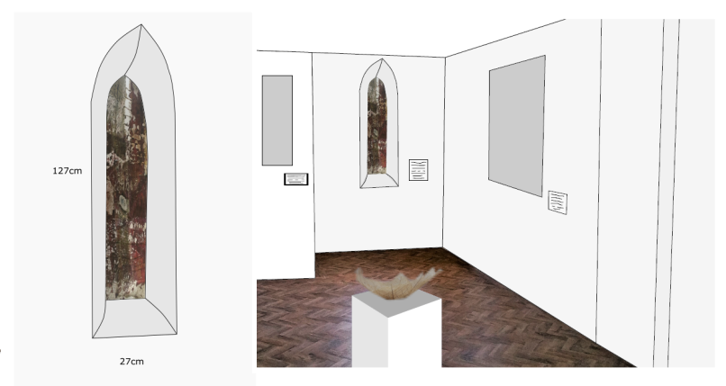
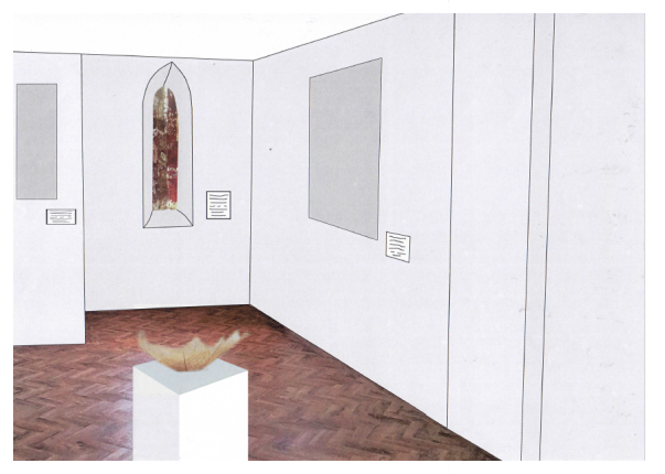
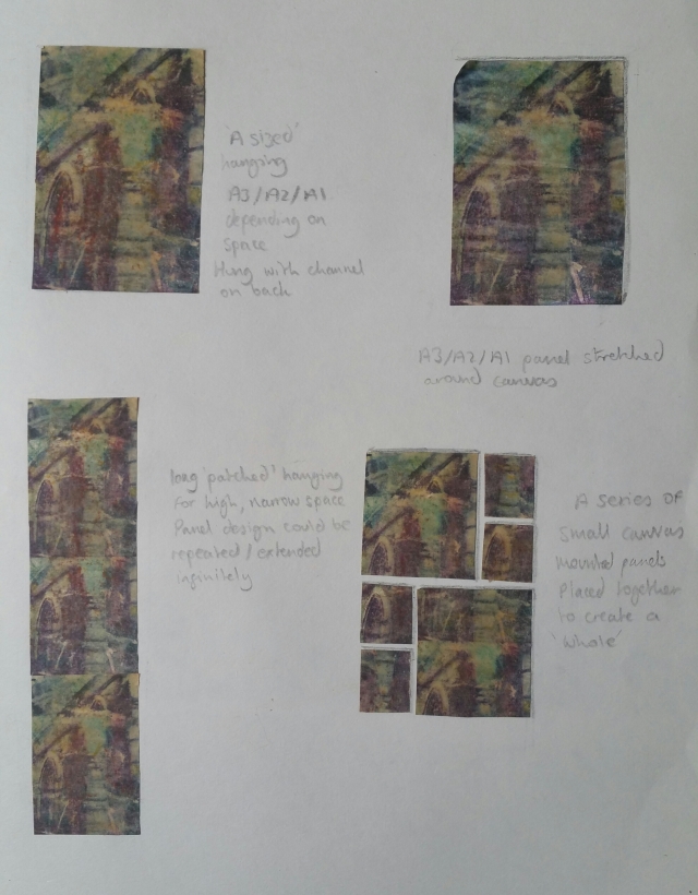
6.4 Illustrated Proposal The proposal describes the concept well. The imagery on the front could be a little more seductive; the plan communicates the space well but it is technical drawing, rather than a rich image to entice the viewer. Consider presenting images of the textiles first, with the technical image on the reverse. A proposal is a marketing tool! You want to win that commission / exhibition! Thank you I will do that!
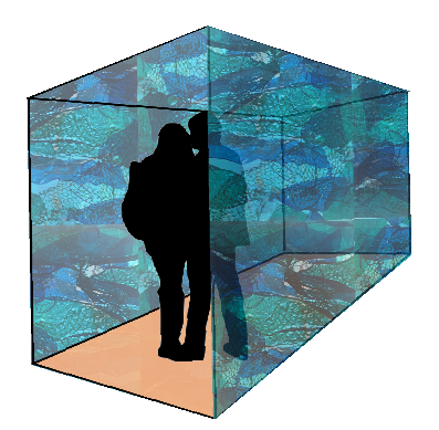
6.5 Independent Project Presentation The proposal reads well, setting the scene of the theme. The third paragraph becomes much more specific about what you want the audience to experience. Some of the description could be more evocative. E.g. instead of “artificial mood lighting”, describe the quality of the light – is it dim, soft, harsh… What is the “mood”? Does the light change / move or is it static? Thank you, I was struggling to find the words! Something to also consider in your evaluation of this work is that it is likely to be quite beautiful – the colours are rich and seductive. How can you create the feeling of unease or disorientation linked to the concept, so viewers don’t just enjoy the aesthetic? Perhaps the plastic could continue almost 360 degrees, with light shining through the floor, so it is more enveloping, immersive and claustrophobic. Or change the box to a more amorphous shape with a smaller entrance…. Exploring the visual communication of the work provides the opportunity to evaluate the success of the original idea. You’ve visualised your idea without allowing the process to challenge you to improve it. Thank you, I will go back and take another look. I originally designed it as a cubicle or box and as discussed in the earlier work it would need to be a very simple shape. I may try showing it a s a tunnel (like you would have at an aquarium) as this could be even more immersive. I do quite like the idea of a sand substrate on the floor suggesting that you are actually walking on the seabed but will try showing it as a 360 degree view to see if that would work better.
Who is the intended audience for the debris trend book? Given that the proposal is an artwork, copying the trend book format is not the ideal communicative tool. The handbook suggests making a mini-portfolio similar to the trend book but not to copy it. The composition of this document -the layout and fonts- are the same as Brightly Light. Given how different the two aesthetics and contexts are, I’d expected to at least see modifications to the format. What would a curator / funder need to see to make the decision about giving you the commission/exhibition? How does the colour palette enhance that person’s understanding of your exhibition proposal? This course has challenged you to analyse contemporary textile contexts, and Part 6 asks you to demonstrate your new understanding. This is a neat summary of the development but does it communicate the concept/narrative of the installation? To be quite honest I really did not understand this part. I have never created a proposal before as I am not an artist (nor particularly want to become one). There was no guidance in the course notes on how this is done and all the information I found regarding producing a good proposal centred more on the illustrated proposal and your artist’s statement. For assessment I will be submitting a portfolio folder containing samples that pertain to this piece and had envisaged the trend book as a summary of the development. I will however take a look at it again and see if I can find a way that makes it work better as a tool to communicate the concept and narrative.
The trend book for ex.6.3 benefitted from the visual research developed in exercises 6.1 and 6.2. It was expected that you would use these methods to develop imagery to communicate your independent project. Whilst you have refined the drawing of the installation, there is limited visual exploration beyond this. Ex.6.5 was the opportunity for you to demonstrate what you’d learnt through part 6, but there is very little new work developed.
Prior to assessment, use skills learnt in exercises 6.1 & 6.2 to visualise your samples as an installation. The mini- portfolio can then contain new work which communicates the form/atmosphere/aesthetic of the installation. Whilst you might not have a large enough sample to photograph as an installation, you could photograph a smaller sample to evoke an appropriate sense of scale and its immersive quality (as you did in ex.6.1). E.g., photographing a sample within a space, as though it’s the edge of the installation; photographing through the sample to capture a silhouette behind it; photographing the samples with ‘mood’ lighting to communicate the atmosphere of your installation. Thank you I will revisit this and make sure it is all included before assessment. I had to submit this assignment before I had managed to completely finish the alterations for part 5 that you suggested due to time constraints.
I also recommended reworking this assignment at the end of part 5, as you hadn’t developed a resolved collection. I think I have seen all these samples before. I strongly advise you to revise Part 5 to ensure you pass at assessment. Yes I have done this now. It wasn’t quite finished when I needed to submit the assignment to get it back before the assessment event.
Learning log: The log is structured well, with selected images used well to illustrate each post and the trend books are so easy to view.
There is minimal proactive research to inform your exploration, which we expect at this level, and there are still many missed opportunities for demonstrating your ability to evaluate your work. For example, in ex.6.1 in the interiors section you include imagery but just write “Other ideas, Left to right: Upholstery fabric, As before wrapped around chair upright, Cushion, Place mat / table runner”. What do you think about these ideas? Which display the fabric best; which are the strongest compositions?
Good evaluation should highlight areas for improvement as well as strengths. More emphasis on analysing what you could do better could have led to the development of a more solid body of work. Similarly, in your end of project evaluation, you often state what you’ve done but don’t explain how or give examples. “During this assignment I had to show a lot of visual awareness, design and composition skills in the making of the images and design proposals. What are the best examples of your composition skills? I also demonstrated using a range of materials and techniques to achieve them. Can you provide an example of where a material or technique was used particularly effectively in relation to the trend, or a technique executed well? I used some technical skills in both the photography and making of the drawings and trend books using both digital and traditional drawing skills throughout.”
“I used my creativity to produce a wide ranging, interesting and varied body of work for the assignment. Where did you do this particularly well? Where could you have improved? Although more technical in some areas than imaginative I tried to imagine what clients customers and audiences require and responded to this in the most creative way I could Where did you do this particularly well? Where did you not do this well.”
Re-working prior to assessment
– Develop a solid body of varied visual research for ex.6.5 based on ex.6.1+6.2. Evaluate and select from this to develop an exhibition proposal with a stronger visual narrative of the installation.
Preparation for Assessment
Reworking textiles: At the end of assignments 4 and 5 I asked you to review and re-work aspects of your course. I can’t find evidence of you reflecting on or acting on my feedback in your learning log. Please ensure the re- worked projects are critically evaluated in your learning log for assessment. Yes I have done this now
Learning log / Research Points: I’ve previously given you feedback relating to proofreading, referencing and critical evaluation. Review all feedback to ensure you’ve addressed the points made. If you are improving older posts, you could add new evaluations to the blog posts in a new colour or date it to make it clear that you’re adding retrospective evaluation. This has now been completed ready for assessment
Presentation: The physical work is usually the first thing the assessors review, followed by exploring the blog. To ensure you communicate your work to its best advantage, ensure the physical submission is really strong, and allow the learning log to play a supportive role. Rather than asking the assessor to hunt through the log to find the photos produced for ex.6.1, for example, print out the strongest images and leave the development work on the log. Part 6 is all about communication and presentation, so ensure that you demonstrate what you’ve learnt in how you present your work for assessment. Thank you I will make sure that I print off the best photographs for 6.1.
The textile tutors have recently written a few blog posts to help students prepare for assessment, which I recommend reading: https://weareoca.com/subject/textiles/textiles-organising-work-assessment/ https://weareoca.com/student-work/textiles-presentation-assessment/ https://weareoca.com/education/textiles-presenting-work-assessment/ –
Thank you, these were all very useful
Tutor name Cari Morton
Date 24th August 2018
Next assignment due N/A
Answers to your written questions:
– As stated above, I recommend printing selected photos, as these will communicate your work to the assessors with more immediacy. It also helps you demonstrate your evaluative skills in selecting the best and most appropriate images. – Presentation of the trend book as a separate booklet or add to original? Presenting it separately is fine. – It can be helpful to print off the learning log, as you can bookmark where each part starts and perhaps add retrospective notes, however, as you say, it isn’t necessary. Assessors are used to viewing it on a computer. I think for your last assessment you printed off piles of artist research which had minimal (or no?) annotation. You haven’t sent me any of this since assignment 2. Please don’t submit this for assessment either. Any research should be embedded and explored within the sketchbook or log (so it is evaluated and applied to your work).